
Victorian TAFE Association
A peak body, providing strategic leadership and advocacy, giving voice to vocational education for all Australians, required a modern, authoritative and accessible visual identity refresh to better support their work advocating for the TAFE network and all Victorian learners, regardless of background or postcode. A visual identity projecting a confident, professional tone was required to help them continue working with members, government, industry and communities to strengthen the vocational education sector and keep public TAFE at the heart of Victoria’s vocational training landscape.
Delivered by Looped-in, May 2026.
The project.
The challengeThe Victorian TAFE Association required a suite of templates suitable for their team’s broad range of capabilities, native to their existing platforms and internal resources. Their existing investment in brand equity meant retaining the existing logo, symbol element and core colours was preferred, requiring the development of a suite of complementary brand assets alongside these existing elements.
This was not a re-brand, but rather an elevation of what already worked well, strengthening the identity through additional supportive visual elements that improved clarity, flexibility and consistency across communications.
The insightCommunications for the VTA are primarily used to support reporting, media releases and sector insights, requiring a considered but flexible range of communicative possibilities across templates and collateral.
The visual identity system therefore needed to support professional and accessible communication outcomes, while remaining easy for internal teams to use across a broad range of applications.
The strategic approachLooped-in undertook an extensive review of the current visual identity system through a detailed brand audit, identifying what worked well, what needed to remain to maintain brand integrity, and where the brand could be further strengthened through supporting visual elements such as typographic hierarchy, colour application and graphic systems.
The effectiveness of the existing template suite was reviewed, resulting in a series of key observations and opportunities that informed the refreshed visual identity approach, including:
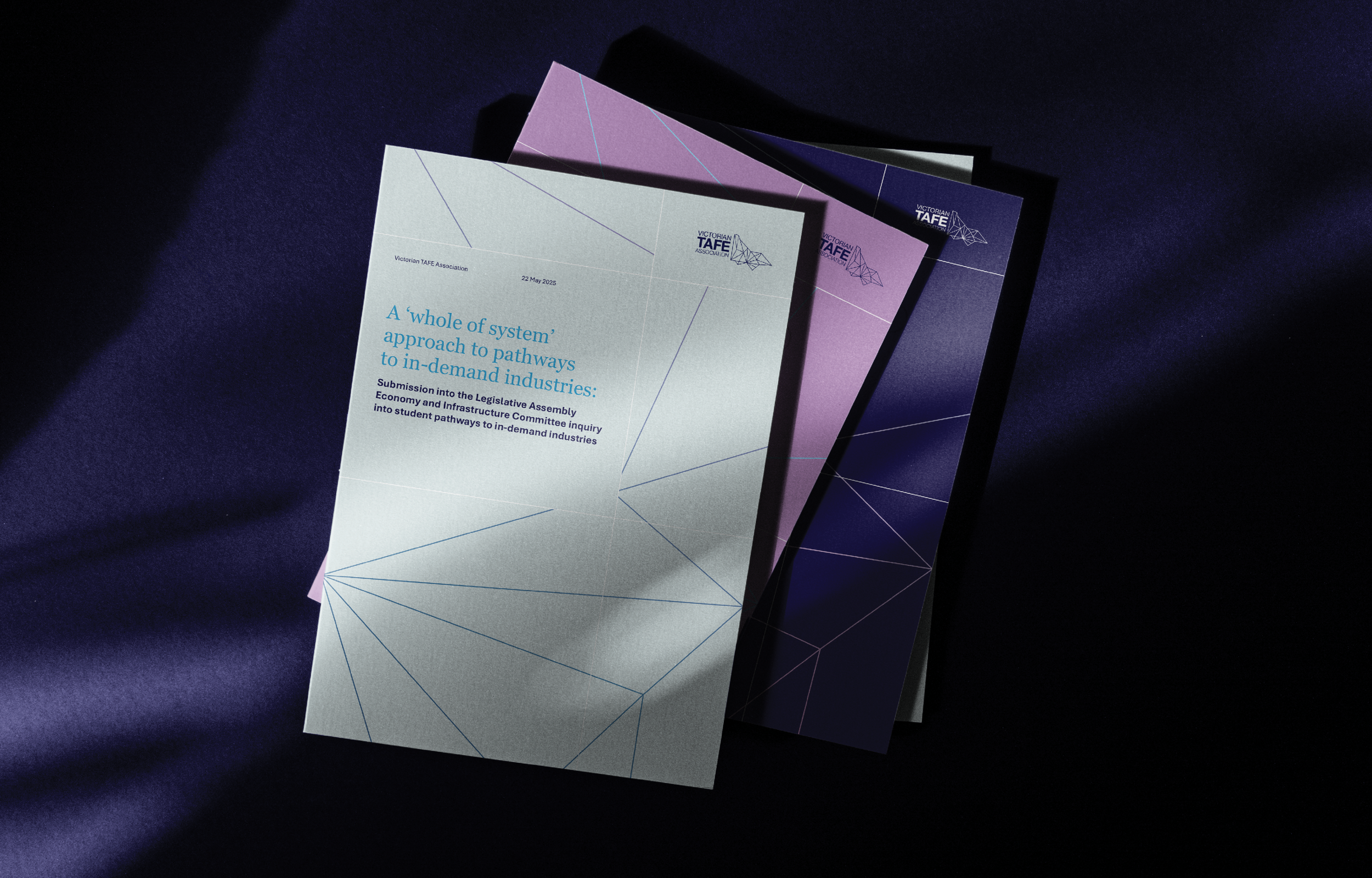
Strengthening the supporting graphic system through the development of a clearer and more flexible set of graphic elements that could be applied consistently across documents, presentations and digital communications.
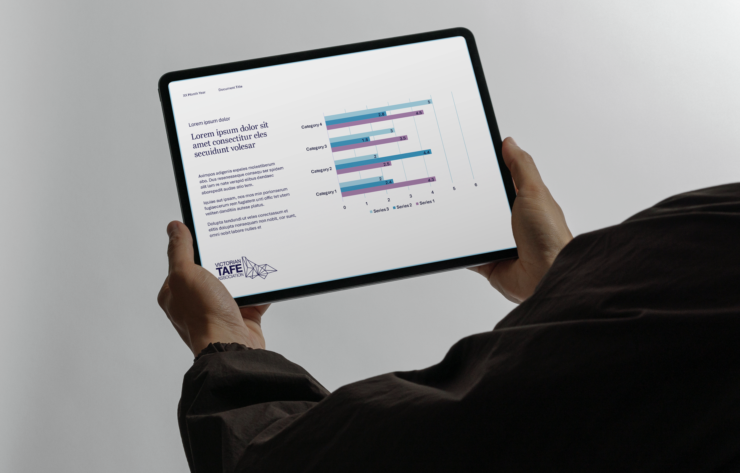
Improving visual hierarchy across templates by refining typographic hierarchy, layout structures and graphic modules to better emphasise key information, data points and messaging.
Expanding the range of brand assets through the introduction of additional visual tools such as patterns, layout modules and supporting graphics to increase flexibility across communication formats.
Maintaining sector credibility while improving distinction through a more cohesive and contemporary visual identity system aligned with the professionalism of the sector.
DeliverablesA discovery audit reviewing the existing visual identity system and current template suite, providing key refinement recommendations and a pathway towards strengthening remaining visual elements and identifying opportunities within the Victorian TAFE Association identity system.
A review of alike organisations, resulting in sector branding observations used to identify opportunities for greater distinction and differentiation from a visual identity perspective.
Development of visual identity concepts based on approved territory directions, tone of voice and desired brand positioning outcomes.
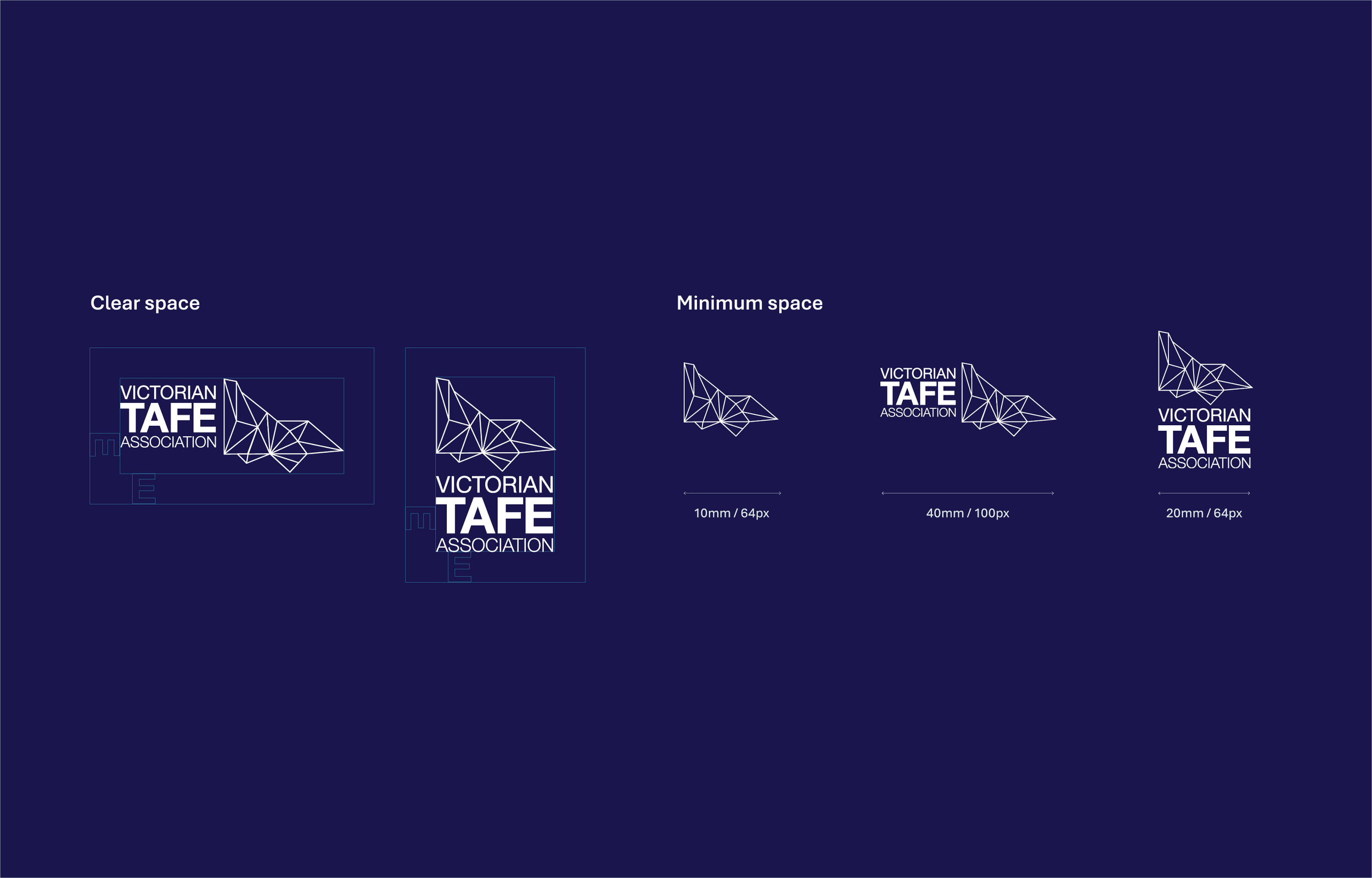
Development of supporting visual elements to accompany retained branding assets, alongside refinement of existing assets and modernisation of the logo and symbol application.
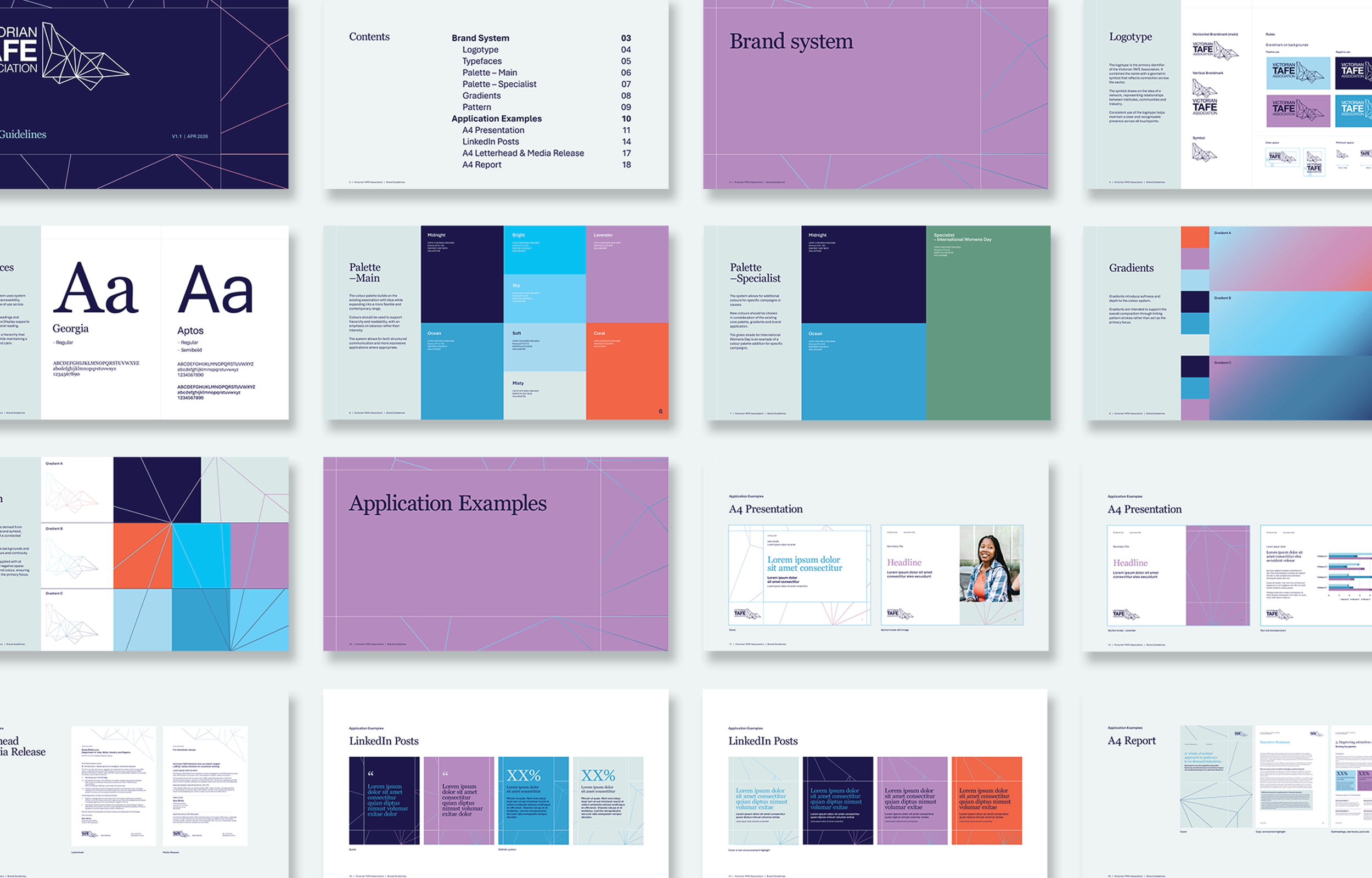
Development of new visual elements including a secondary colour palette, gradient system, typography system and supporting pattern graphics with built-in flexibility and scalability across a variety of applications.
Brand guidelines designed to collate brand information and support future teams in applying the visual identity consistently, while maintaining brand integrity through clear colour, typography and logo usage guidance.
A tailored template suite designed to support organisational communication needs and print requirements, including:
A4 Presentation Template
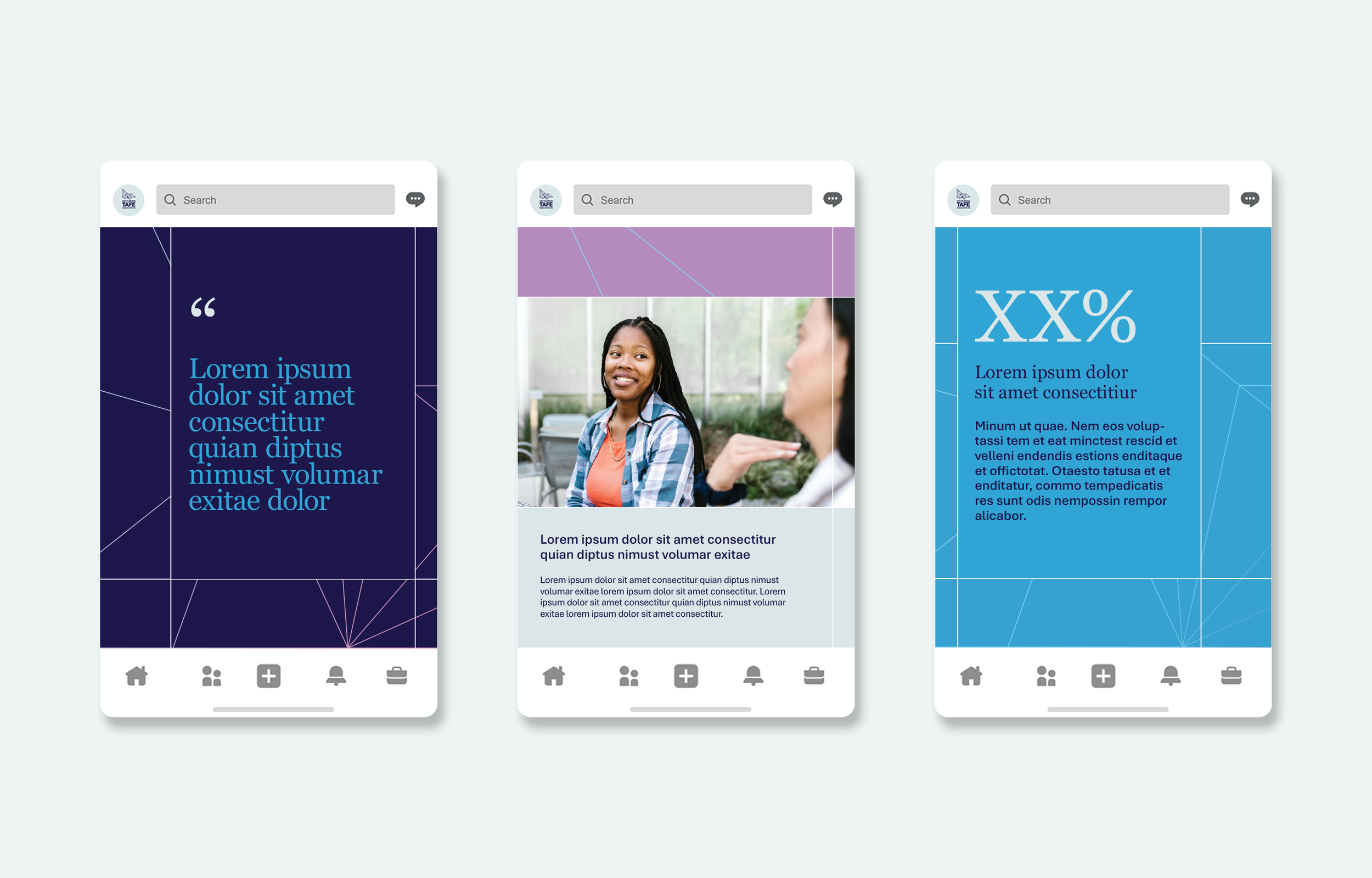
LinkedIn Templates
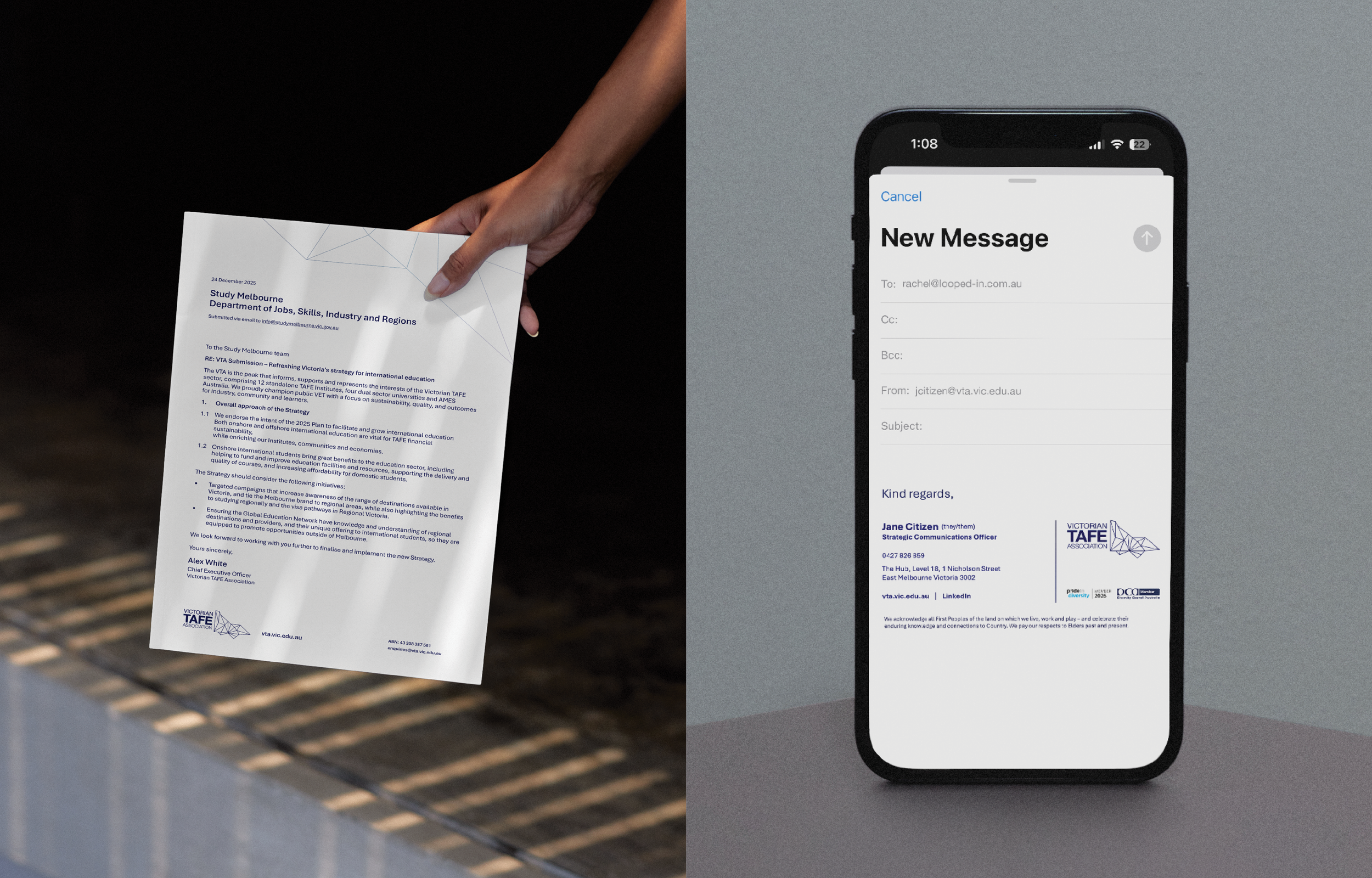
Letterhead & Press Release Template
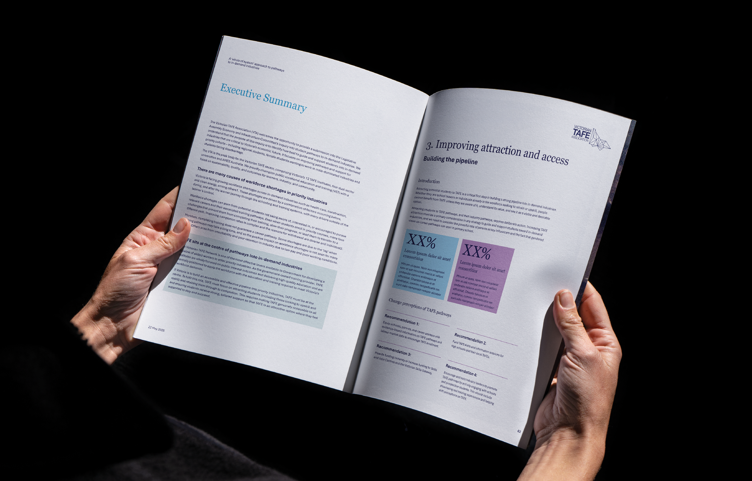
A4 Reporting Document Template
Delivery of visual identity assets including refined logos, approved colour files and supporting background graphics supplied in professional production-ready file formats.
The impactWe delivered a refreshed brand identity that expanded the use of the existing symbol system, allowing it to scale into background elements and function as an additional brand signifier across communications. The emphasis of this element could be scaled up or down in visual contrast, allowing flexibility across applications, from more vibrant social media assets, through to restrained corporate documents such as letterheads and media releases.
The colour palette was enhanced through a review of colour theory, visual contrast and accessibility standards, ensuring the palette felt distinct to the brand while supporting readability across both print and digital applications.
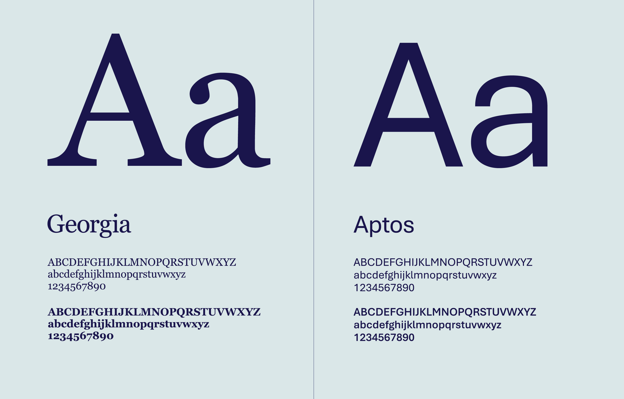
A system native typographic pairing was introduced to support ease of use internally, while deliberate typographic choices helped modernise and refresh the overall identity. Typographic hierarchy was strengthened across the full suite of assets to improve clarity, consistency and ease of communication.

Need support?
If you’re building something purpose-led and want to move from opinions to evidence, you’re in the right place. Whether you need audience insight, communications support, or a strategic brain in your corner, Looped-in helps you make decisions informed by the people you serve.